Proposal for a new flag: Saginaw MI
|
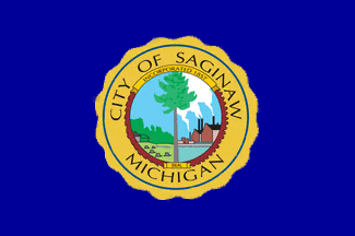
I recently came across an insightful TED talk by Roman Mars on the topic of flag design. The talk titled, "Why City Flags May Be the Worst-Designed Thing Never Noticed," introduced some fundamental principles of flag creation. One primary rule emphasized was that a city flag shouldn't incorporate its city seal or any lettering. Intrigued, I decided to look up the flag of Saginaw, Michigan, where I reside. This is how it appears:
|
L
|
The current design of the flag isn't optimal for its intended purpose. It essentially places the city seal against a blue backdrop. While I respect and appreciate the seal for its design, it wasn't crafted with the primary intention to serve as a flag. As a result, when displayed as a flag, its details, especially the text, become indiscernible from a distance, and its overall design seems commonplace. Inspired by Roman Mars' talk and other references, I've taken a shot at designing a revamped flag for Saginaw City, with a special shout-out to SVSU Graphic Design Professor Blake Johnson for assisting:

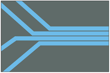
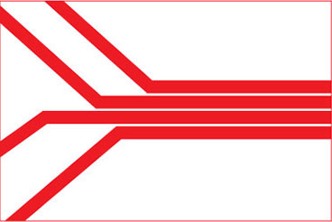
Saginaw City lies close to where the Saginaw River forms. My flag design offers a minimalist depiction of this geographical characteristic, symbolizing the convergence of the Cass, Shiawassee, Flint, and Tittabawassee rivers to form the Saginaw River. On another level, this design stands for the unity of Saginaw's people, joining together for a common goal of shared prosperity. Regrettably, this natural landmark, which ought to symbolize unity, has been a point of divide between the populations on opposite sides of the river. Through this proposed flag, I urge the Saginaw community to view the river as a beacon of collaboration and progress. It's my aspiration that Saginaw's residents rally behind this flag as a shared emblem leading them forward.
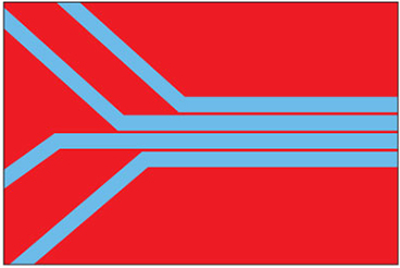
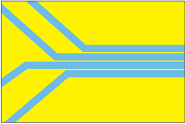
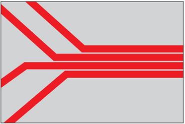
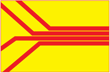
For those interested, I've also come up with several other color variations for the flag. Your feedback on these, or suggestions for other combinations, can be provided in the survey below.
For those interested, I've also come up with several other color variations for the flag. Your feedback on these, or suggestions for other combinations, can be provided in the survey below.
|
|
|